DataVis.ca
Michael Friendly
York University

Darts |
|---|
 The Lie Factor
"The representation of numbers, as physically measured on the surface of the graphic itself, should be directly proportional to the quantities represented."He measures the violation of this principle by the Lie Factor, defined as the ratio of the size of an effect shown in the graphic to the size of the effect in the data.
| Picture | Words |
|---|---|

|
The Lie Factor.
Full size
(from Tufte, 1983, p.57); gif image by Clay Helberg, Pitfalls of Data
Analysis
This graph, from the NY Times, purports to show the mandated fuel economy standards set by the US Department of Transportation. The standard required an increase in mileage from 18 to 27.5, an increase of 53%. The magnitude of increase shown in the graph is 783%, for a whopping lie factor = (783/53) = 14.8! |

|
The Lie Factor.
Full size
(from Tufte, 1983, p.69)
Another key element in making informative graphs is to avoid confounding design variation with data variation. This means that changes in the scale of the graphic should always correspond to changes in the data being represented. This graph violates that principle by using area to show one-dimensional data, giving a lie factor = 2.8. |
|
Rubber-band Scales.
Full size (413 x 409) [10k]
(from Wainer, 1997, p.29)
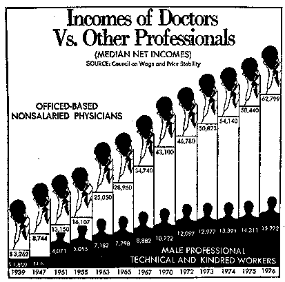
A less obvious (and therefore more insideous) way to create a false impression is to change scales part way through an axis. This graph, originally from the Washington Post purports to compare the income of doctors to other professionals from 1939--1976. It surely conveys the impression that doctors incomes increased about linearly, with some slowing down in the later years. But, the years have large gaps at the beginning, and go to yearly values at the end. If you are going to use rubber-band scales, try to make the axis values small and visually indistinct, as this graphic sinner did! |
|
Rubber-band Scales - Unstretched.
Full size (297 x 254) [2k]
(from Wainer, 1997, p.30)
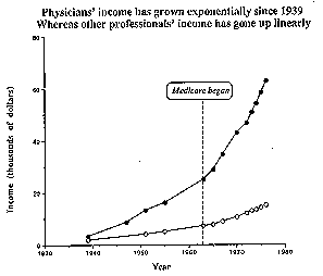
A re-drawing of the graph, with year values spaced appropriately, gives an entirely different message -- doctors income now appears to have increased exponentially, while the incomes of other professionals seems to have increased linearly. The annotation of the date when medicare began suggests another interpretation -- linear increase, but with two differnt slopes before and after the implementation of the medicare system. We can think about these competing models of the data now that the data are portrayed fairly. |
