DataVis.ca
Michael Friendly
York University

Darts |
|---|
 Context: Compared to What?
When the goal of a graph is to allow comparison, or show the difference between circumstances, the question to ask is, Compared to what?.
| Picture | Words |
|---|---|
 |
Display data in the proper context
Full size
(412x374) [10K] (from Tufte, 1983, p. 74)
Does stricter enforcement of speed limits lead to a decline in trafic fatalities? You surely can't tell from this graph. What does it mean to show a decline in traffic fatalities over two years? What was the trend before the change in enforcement? after? Failure to show the relevant context produces a thoroughly misleading display. |
 |
... That context tells a different story
Full size
(412x333) [8K] (from Tufte, 1983, p. 74)
Now we can see that there must be some other important factors other than stricter enforcement.. This information would be completely missed if all you had to look at was the former graph. |
 |
The Great Currency Mountain
Full size (354 x 217) [4K]
(From A.J. Jaffe & H. F. Spirer, Misused Statistics, p. 77)
A Wall Street Journal article displays this graph in an article headlined "Americans hold increasing amounts of cash despite inflation and many other drawbacks". Unfortunately, the data plotted has not been adjusted for inflation. |
 |
... Cut Down to Size
Full size(354 x 200) [2K]
Redrawn, adjusting for inflation. We now see that there has been a slight rise in the anount of currency in circulation, but hardly anything to get excited about. What else has not been adjusted for? |
 |
Who's on First?
Full size (453 x 372)[11K]
This graph, from The Scientist, Citation Data Reveal World Rankings Of Scientific Papers is summarized by the following: European Union (EU) scientists now publish about as many papers as scientists from the United States, according to a new survey conducted by Science Watch. During the past 16 years, the EU's share of research papers increased from 30.5 percent to 36.2 per cent, while the U.S. share fell from 40.5 percent to 36.5 percent. .... As the graph shows, the EU increase and the U.S. decline have now reached a point of intersection, with the U.S. share of the world's total research papers currently exceeding Europe by only a few tenths of a percent.Unfortunately, the 3D "wall graph", even with reference lines across the back, is a poor choice for making comparisons of this kind. A simple line graph would be much better, since comparisons between regions would be direct. Beyond this, the question, "Compared to What?" arises here, as well. The article does mention that membership in the EU rose from 10 countries in 1981 to 15 in 1995, but this is not accounted for in the graph. |

|
Emphasize trivial comparisons.
Full size (330 x 415) [27k]
(from Wainer, 1997, p.31)
It is easy to avoid the important, useful or relevant comparisons by separating them visually, or making trivial relations more prominant. This graph, originally from Social Indicators III purports to compare trends in the median income of men and women by levels of education. But stacking the graphs for men and women vertically hides the large gender difference in incomes, while emphasizing the obvious result that higher education leads to greater income. Stretching out the horizontal scale also helps to hide any trends over times. |

|
... re-designed.
Full size (344 x 306) [6k]
(from Wainer, 1997, p.31)
The vertical scales of income for men and women may be directly compared simply by arranging the plots horizontally. Connecting corresponding curves in the two panels helps to show the difference at the same level of education. Time trens are also made more apparent by compressing the horizontal axis in each plot. [This plot would be even better if the background grid was lighened or eliminated.]
|

|
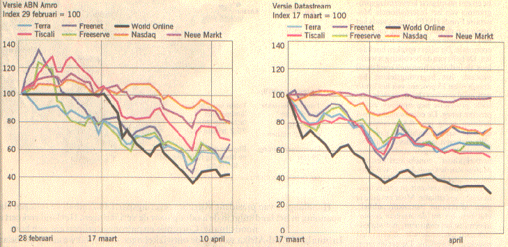
Shifting the sands of time.
Full size (361 x 353) [43k]
Both images, full size (729 x 353) [83k]
(from NRC Handelsblad, May 27,
2000)
Index numbers are widely used to standardize a time series to a given date so that trends may be compared more easily, as in the consumer price index. Skillful manipulation of the base date and the axes, however, may be used by the unfair-minded to enhance or suppress differences between different series. Here is a lovely and compelling example of How to Lie with Graphs from Niels H. Veldhuijzen. This graph appeared in connection with the recent debacle of the Dutch internet provider World On Line (WOL), which sought a stock market quotation on the Amsterdam Stock Exchange. The stock prices went to nearly zero within a day! The Dutch bank (ABN AMRO), leader of the syndicate responsible for the quotation, said: "We could not foresee this. Many other funds were in a downfall too; some of them more than WOL." The bank illustrated this by a graph with index numbers. Note that the chart starts at February 28. WOL (the black line) doesn't look too bad, compared with the other time series. |
")
|
... Unhifting the sands of time.
Full size (361 x 353) [43k]
Both images, full size (729 x 353) [83k]
WHOA!! -- why is that black line for WOL flat at 100 from Feb 28 to March 17? Well, the stock market quotation of WOL didn't occur until March 17! Unhifting the base date for the index numbers to March 17 give this graph, in which WOL appears to be very quickly heading down the toilet.
[Credits:
Niels H. Veldhuijzen provided these graphs, and most of the accompanying
text. He says:
"How to lie with statistics [by Darrell Huff] may
be fifty years old (still in print!), but people never learn."
Well, maybe they did!]
|

|
The road to hell is paved with ... .
Full size (427 x 534) [44k]
This image, from the cover of the Ithaca Times (Dec. 7, 2000) may well be the most misleading graph ever published. It provides a spectacular example of more graphical sins than I have ever seen in one image. The cover story, "Why does college have to cost so much?" shows a large graph superimposed on a scene from the Cornell campus. There are two jagged lines running across the graph, one labeled "Cornell's Tuition" and the other "Cornell's Ranking". The tuition graph shows a steady rise, and the ranking graph, after some early meandering, plummets to an alltime low. The clear impression is that students are paying more for far less. Better yet, most traces of the crimes (described below) have been concealed by removing scales and other context from the cover image. |
")
|
... bad graphic designers! .
Separate graphs, full size (313 x 514) [49k]
What's wrong with these pictures?
More careful reading of the whole article (buried several
pages into the paper) reveals a different story:
[Credits:
Dave Bock, from Ithaca, NY provided these graphs, and most of the accompanying
text. He says:
"Egad. There must be an award this newspaper deserves."
Yes, and now they've gotten it!]
|
