DataVis.ca
Michael Friendly
York University

Time keeps on slippin, slippin, slippin, into the future..., Steve Miller Band, Fly Like an Eagle
Timelines and Visual Histories
This page is an annotated visual gallery of some timeline designs from their origin to today. Although time is one-dimensional, telling some story of history visually is much more complex, and it is quite instructive to see together how different graphic designers have aproached this problem.
Contents:
Visions of history from the past
| Picture | Words |
|---|---|

|
Cartographies of Time.
Full size (250 x 309; 19K)
Description: This new book, Cartographies of Time, A History of the Timeline by Daniel Rosenberg and Anthony Grafton is a beautiful history of graphic representations of time in Europe and the United States from 1450 to the present. In many ways it supplants the information and images posted on this page, with an analytical history of the representation of time, together with higher-resolution versions of some of the images posted here and many more previously available only in a few libraries. It's a bargain at about $30! See also this notice from FlowingData |

|
Carte chronologique.
Full size (447 x 448; 35K)
Description: The earliest modern timeline was created by Jacques Barbeu-Dubourg (1709-1779) in 1753. This ``Carte chronologique'' was an annotated timeline of history (from Creation) on a 54-foot scroll. It included names and descriptive events, grouped thematically, with symbols denoting character (martyr, tyrant, heretic, noble, upright, etc.) and profession (painter, theologian, musician, monk, etc.) |

|
Joseph Priestley's Chart of Biography
Full size (739 x 353; 69K)
Description: Joseph Priestley (1733-1804) was one of the first to attempt to depict historical events graphically. This image, from 1765, was designed as a proof-of concept for a much large, more detailed version, showing the lifespans of 2000 famous people, from 1200 B.C. to 1750 A.D. Priestley divided the people into two categories: Men of Learning and Statesmen, and and is credited with inventing the idea of showing their lifespan by the length of a horizontal line. He also invented the convention of using dots (...) to indicate uncertain birth and death dates. |

|
Joseph Priestley's New Chart of History
Full size (1104 x 731; 453K);
B/W version (1114 x 704; 213K);
Description: Priestley was interested in depicting history in a more comprehensive and analytic way than had been done before. His New Chart of History was published in several editions, starting around 1769 (this one dedicated to Benjamin Franklin). He uses a left-to-right linear scale for time (from 1100 BCE to 1700 AD), and groups regions and civilizations in bands, stacked vertically (from America at the top to European regions at the bottom). The bottom strip gives the names of some important rulers (from Saul and David to George III). Color was difficult to reproduce in this time (this image was hand-colored), but Priestly uses it to some useful effect to link different regions controlled by the same powers. This makes it easy to see the extent of the Roman Empire (green), the Saracens (yellow) and English (blue), though the geography at a give time requires some study to decipher. |

|
Reigns of English monarchs
Full size (651 x 311; 31K)
Description: Etienne-Jules Marey (1830-1904) used this timeline in 1885 to show the reigns of kings and queens of England, from 1660 to 1860, in relation to periods of peace and war.
|

|
Train schedule string-line graphic.
Full size (803 x 466; 71K)
Description: This diagram, showing the time schedules of trains from Paris to Lyon and vice-versa, was published by Marey in his book, La Méthode Graphique (Paris, 1885), who attributed the design to the French engineer, Ibry. This design makes it easier to determine the fastest trains (steeper slopes), lay-overs (line breaks), and the intersection points of south-bound and north-bound trains. The design works as a graphic calculator because the stations are spaced on the vertical axis in proportion to distance along the route. Today, such diagrams are sometimes called ``string line charts,'' because they were often constructed by using push pins and colored strings, in an attempt to optimize train schedules. |

|
Minard's visual history of Napoleon's Russian Campaign.
Full size
Description: The French engineer, Charles Minard (1781-1870), illustrated the disastrous result of Napoleon's failed Russian campaign of 1812. The graph shows the size of the army by the width of the band across the map of the campaign on its outward and return legs, with temperature on the retreat shown on the line graph at the bottom. Many consider Minard's original the best statistical graphic ever drawn. But in essence, it is also a visual history, relating troop strength, geography, battles, and winter temperature in a single image. E. J. Marey commented that Minard's graphic ``defied the pen of the historian in its brutal elegance.'' |

|
Emma Willard's Temple of Time.
Full size
Description: The Temple of Time is a three-dimensional projection of historical chronography created in 1846 by Emma Willard, an American girls' educator. In the temple, the vertical columns represent centuries, with those on the right showing names of important figures from the Old World while those on the left show figures from the New World. The floor shows a historical stream chart. The ceiling functions as a chart of biography. It was designed as a mnemonic device that allowed people to memorize information by imagining it as architectural details in a three-dimensional mental space. See Standing within The Temple of Time. |
Encyclopedic, static charts
| Picture | Words |
|---|---|
 
|
Hammond's Graphic History of Mankind
Full size (1200 x 825; 237K); Last panel (1200 x 871; 335K)
Description: The Hammond World Atlas Corp. produced this 8-page, fold-out Graphic History of Mankind in conjunction the Hammond Historical World Atlas. The author/designer is unknown. It was apparently produced around 1999, the last recorded event. The legend describes the designer's intent, and is worth quoting in full: This chart presents a synopsis of major historical events from the dawn of civilization to the present. Each nation or ethnic group is shown by a color band, with dates of important persons and events to the right. Reading downward, one may follow the rise and fall of empires, the emergence of new cultures and the migration of others. With a glance across the chart, the reader can view developments in all parts of the world at a particular moment in history. The relative expansion and decline of world powers is indicated by the widths of the columns. Stripes in a different color show conquest or stron outside influence by an outside nation. When a nation loses it's political or cultural individuality, the column merges into that of another group. |

|
Rand McNally Histomap of World History
Full size (1080 x 725; 204K);
Last panel (1124 x 720; 237K);
Complete image (975 x 4808; 2169K), from The New Atlantis ;
Histomap photo (200 x 632; 27K), from Kevin Kelly's - Cool Tools
Description: John B. Sparks developed this Histomap of World History: The Story of Civilization in a Single Timeline around 1932. It was published by Rand McNally, and sold well for decades. The current version shows significant historical events from about 2000 B.C. to 2000 A.D. in a vertical format (about 29 cm x 160 cm). Different vertical strips show various peoples and civilizations, with width proportional to influence at the time. The vertical time scale is not uniform, and suggests the true logarithmic timescale developed at about the same time by Heinze Von Foerster. |
Special purpose, static charts
| Picture | Words |
|---|---|
 |
History of the U.S. Civil War. Full-size image 288 x 400 (101k)
This image, from the Library of Congress, Visual Memory Project, History of the Civil War in the United States, 1860-1865 shows the progress of the war, with a time scale in months, and principal battles, troop movements, etc, using "Scaife's comparative and synoptical system of history applied to all countries." A reproduction may be purchased from the Kroll Map Company |
  |
HistoryShots: History of U.S. Political Parties
Full image, medium size (511 x 241; 45K);
Full image, large (792 x 374; 164K);
Detail1 (541 x 300; 76K)
Detail2 (541 x 200; 52K)
Description: These images are from one of a series of beaautifully designed, poster-size charts prepared by Larry Gormley and Bill Younker of HistoryShots. This one shows the history of the US political parties from 1892--2005, on a horizontal time scale with details about political events, issues and administrations.
[Credits:
These images are Copyright © 2006 HistoryShots, LLC. All rights reserved;
used here by permission.]
|


|
Geneaology of Pop/Rock music: Rock and Roll is Here to Pay.
Poster, 500px (474 x 246; 66K) ;
Scan from Tufte (1500 x 696; 456K)
Description: This graphic was originally designed by Steve Chappel and Reebe Garofalo in Rock 'N' Roll is Here to Pay: The History and Politics of the Music Industry (1977). It was reproduced by Tufte (1997, p. 90-91), and most recently prepared as this poster by HistoryShots. It is partly a categorized genealogy of rock and pop music, indicating the birth of stylistic categories in bold letters (RockaBilly, British Invasion, Acid rock, Country rock, etc.), and the individual timespans and legacies of particular musicians and groups by arrows, on a horizontal time scale showing start/end of influence. Added to this is a vertical scale, showing the dollar volume of record sales, presumably as a percent of total. For more details, see the Story behind the chart [Credits:
The poster image is Copyright © 2006 HistoryShots, LLC. All rights reserved;
used here by permission.]
|


|
History by the Meter.
Closed view (600 x 76; 36K);
Epoch view (600 x 685; 193K);
Event view (600 x 670; 204K)
Description: If you ever need to measure the distance between two historical events or want a unique meter stick, History by the Meter, produced by www.metermorphosen.de, is for you. The epoch side indicates historical epochs, in periods of about 200 years, with a scale of 1cm = 10 years. Various themes (Nihilism, Colonization, Gothic architecture) in three parallel streams of time (Mind, Power, the Arts) are marked, in the various named epochs of history. The event side, marked with a cm. scale, shows individual events in history, including such delightful things as-- 10AD: 1st public library in Rome; 552: Silk worms arrive in Europe; 1015: Arabia: medical use of caffeine; 1335: Punch & Judy shows in Europe, handguns. |
Correlated histories
| Picture | Words |
|---|---|

|
Futures Watch.
Full size (635 x 471; 140K);
PDF version (1175K);
Description: Peter von Stackelberg designed this complex timeline of social, technological, economic and political events and trends from 1750 to 2100. Each time series shows graphs, events and categories on a common scale. Peter says: The purpose of the timeline is to provide a visual tool for looking at events across a relatively long period of time and identify patterns and interrelationships involving a broad range of factors. Identification of patterns is particularly important when attempting to look at the future of complex social, technological, economic, and other systems. See Peter von Stackelberg: What I was thinking for a more complete description of this timeline design. |

|
Correlated history of the earth.
Detail, full size (480 x 640; 58K)
Full poster (low-res) (321 x 432; 57K)
Description: The poster, A Correlated History of the Earth, shows a global view of the history of the earth over 4.5 billion years, on a logarithmic time scale. Each column is a timeline from ancient times to recent. Included are plate tectonic maps, mountain building events(orogenies), major volcanic episodes, glacial epochs, all known craters from asteroid and comet impacts, over 100 classic fossil localities from around the world, fossils, ranges of plants, invertebrates and vertebrate lifeforms, and major extinction events as revealed by the fossil record.
|

|
Synchronoptic History Chart.
Full size (270 x 500; 103K)
Description: The Synchronoptic History Chart, designed by Andreas Nothinger, combines lifelines of individuals, parallel timelines of over 3000 events relating to science, culture and politics, and 24 historical maps in a single chart. There is an online version, HyperHistory Online illustrated below. |
Non-linear scales for time and space
| Picture | Words |
|---|---|

|
Hyperbolic viewer.
Full size (469 x 373; 4.8K)
Description: This graph shows how a hyperbolic viewer design can smoothly decrease resolution in relationship to distance from a focal point in time. The principle is that Resolution x Distance from focus = Constant. The same idea applies to space, in two dimensions in the fish-eye map.
|

|
Logarithmic timeline.
Full size (800 x 244; 28K)
Description: Heinz Von Foerster (1911-2002) designed this schema for showing all historical events over an enormous time scale (from the Big Bang to today). The timeline is laid out on a reverse log timescale, with dates and events spaced according to log (today - date). Foerster used it both to present a large scale view of time, and to suggest that memories and details about the past fade roughly in an exponential fashion. |

|
Milestones categorized timeline.
Full size (761 x 381; 58K)
Description: Here we use a reverse square-root scale to show the time distributions of events in the Milestones of Data Visualization, categorized by aspects of the Form of innovation and its Content. This has the effect of spreading out more recent events relative to older events, providing the possibility to show more detail of the former. Positions on the horizontal time scale are spaced according to the formula 2* (25 - sqrt(2000 - year)).
|

|
Geschictesbaum Europa - Tree view of European history
Full size (1000 x 1043; 390K)
Description: A novel design is used in the Geschictesbaum Europa (author unknown) to show a thematic view of the entire history of Europe in a tree structure. With the base of the trunk at 0 A.D., branches for different countries (Germany, France, Spain, ...) and domains of thought ( politics, church, culture) grow upward and outward. Dated events appear as the leaves of the tree. Events B.C. are shown under the roots of the tree. This space-filling design automatically allows greater detail at the periphery, corresponding to more recent times. Note that a linear scale for time, outward from the center, automatically provides space for detail proportional to the square of distance from the origin. |
Dynamic, interactive timelines
- Zoom - Unzoom tools alleviate the need to choose a fixed time scale, either linear or non-linear
- More - Less: Amount of detail can be selected interactively
- Multiple views: No need to choose a single form of representation if you can select among several alternative views
| Picture | Words |
|---|---|

|
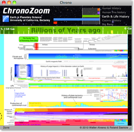
ChronoZoom.
Full size animated image (425 x 418; 155K);
Full size static image (451 x 444; 193K);
YouTube video
Description: ChronoZoom (http://www.chronozoomproject.org/), by Roland Saekow & Walter Alvarez from the Department of Earth and Planetary Science at University of California, Berkeley, touts itself as a "zoomable timeline for the history of everything". It is designed to allow a dynamic, interactive display of the entire span of time, from the Big Bang, to the time of the dinosaurs, to the present, allowing an exploration of "Big History". From the perspective of Earth and Planetary Science, it covers four major historic regimes of Cosmic, Earth, Life and Human history, up to the present. The present implementation requires the Microsoft Siliverlight Plug-in to work with your browser. |

|
Baby Name Wizard: Name Voyager.
Full size (names: 'Mi' selected) (779 x 502; 55K);
All names view (777 x 503; 115K)
Description: The Baby Name Wizard, NameVoyager is an interactive Java applet designed to show the time distribution of the popularity of various male and female names over time. This image shows all names starting with the letters 'Mi'. The vertical dimension shows the relative number of children given a particular name in each year, so the varying heights of the colored bands indicates relative popularity. The result is like a continuous version of a stacked bar-chart display. |

|
ThemeRiver.
Full size (675 x 414; 32K);
Theme River paper
Description: Theme River is a proof-of-concept application developed at Pacific Northwest Laboratories for analysis of time-related patterns, trends, and relationships across a large collection of documents. As in the Name Voyager, the themes in the collection are represented by a "river" that flows left to right through time. The river widens or narrows to depict changes in the collective strength of selected themes in the underlying documents. Individual themes are represented as colored "currents" flowing within the river. The theme currents narrow or widen to indicate changes in individual theme strength at any point in time. |

|
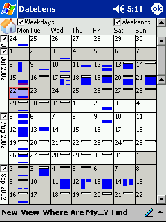
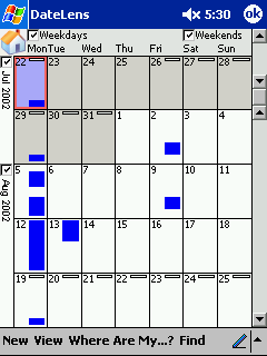
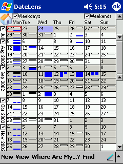
DateLens: A zoomable PDA calendar
Home view (240 x 320; 8.5K);
Month view (240 x 320; 6.8K);
Big view (240 x 320; 9.7K);
Focus view (240 x 320; 9.7K);
Description: The Table Lens provides the means to visualize large tables using a combination of zoom or focus plus context. DateLens, developed by Ben Bederson of the HCIL at the University of Maryland applies these ideas to your calendar on a handheld PDA device or desktop application.
|

|
Movies Timeline.
Full size (793 x 611; 125K)
Description: An interactive Flash proof-of-concept application by Patrick Mineault, www.5etdemi.com, the Movie Timeline (no longer functional; see 5 1/2 blog) provides parallel time scales for movies, stars, technological advances and cinematic events. Zoom and un-zoom buttons allow the user to expand/contract the time scale around any given period.
|

|
HyperHistory Online.
Opening screen (768 x 389; 38K);
Events in science ;
People in history ;
Description: HyperHistory Online provides multiple, linked views of 3,000 years of world history with an interactive combination of parallel lifelines, timelines, and maps. Each view can be zoomed to show more detail, people and events are color coded by categories, which can be selected, etc. |

|
Onetimeline.
Full size (968 x 686; 197K)
Description: Onetimeline (now defunct) operated as a web crawler that searches the web and classifies events in time. When you search for a topic ("Beatles' in this image), it selects the relevant events and displays them as a timeline, with a varying time-resolution scale at the left. You can select one of 5 levels of detail with the Detail Level buttons at the top.
|

|
LifeLines: Visualizing Patient Records.
Full size (1024 x 768; 168K);
Other screen shots;
Technical report (PDF)
Description: Lifelines is an interactive application developed by Catherine Plaisant and others at the University of Maryland HCIL for visualizing a patient's medical records and medical history.
A one screen overview of the record using timelines provides direct access to the data. For a patient record, medical problems, hospitalization and medications can be represented as horizontal lines, while icons represent discrete events such as physician consultations, progress notes or tests. Line color and thickness can illustrate relationships or significance. Rescaling tools and filters allow users to focus on part of the information, revealing more details. |
|
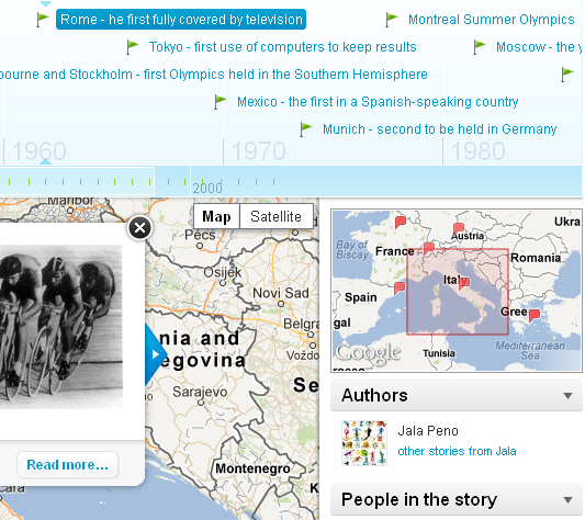
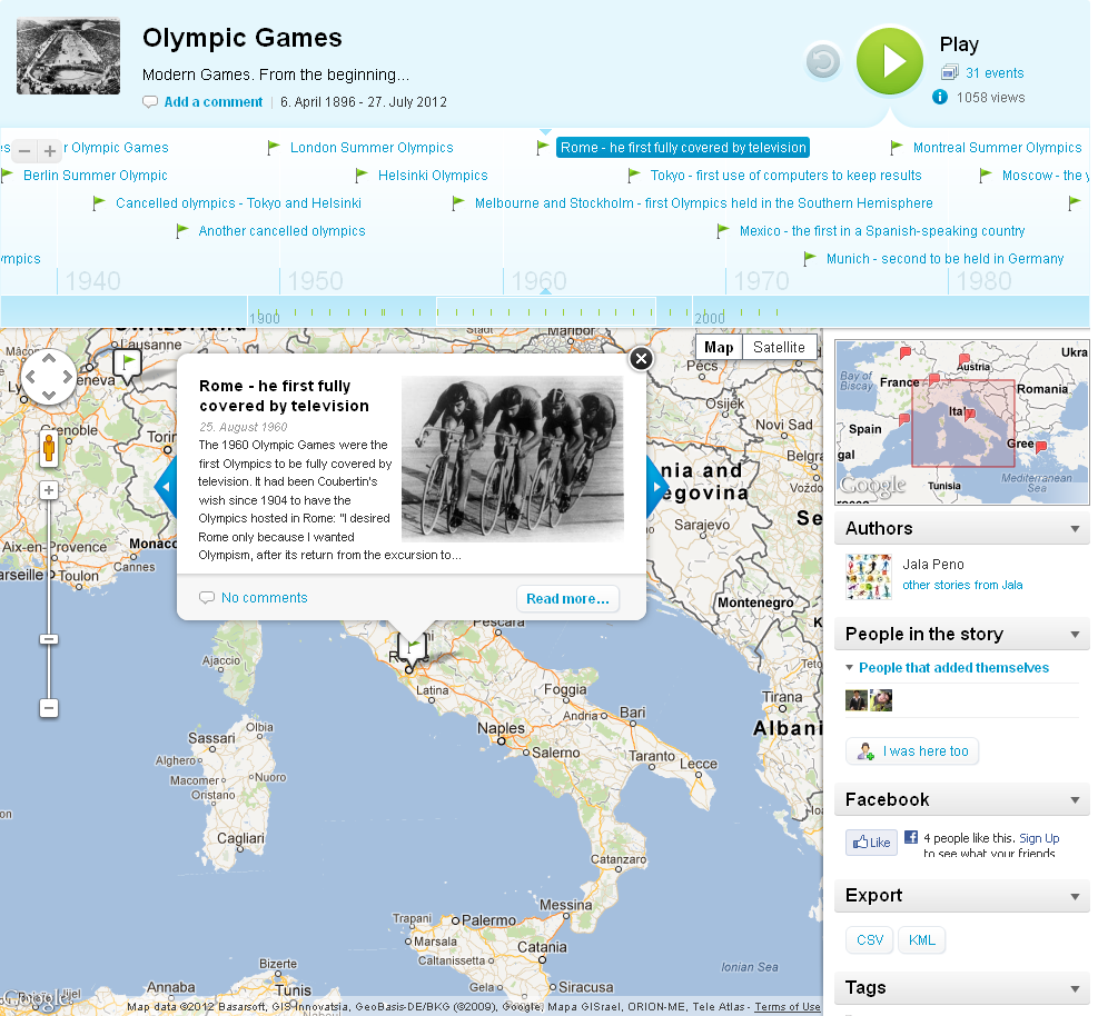
DIY Visual Histories: myHistro.com
myHistro Olympics cropped (full size) (533 x 474; 170K);
myHistro Olympics (full size) (987 x 914; 460K);
Description: MyHistro is a timeline creation website that focuses on the geographical visualization of events by integrating with Google maps. Combining maps and timelines with images, videos and text, users can create interactive travel journals, can tell the history of a brand or a celebrity and most importantly can create educational timelines of historical events.
|
Other links
- Cabinet Magizine: A Timeline of Timelines
- Juan Dursteler, www.infovis.net article on Visualizing Time
- Simile: Timeline project: Timeline is a DHTML-based AJAXy widget for constructing visualizations of time-based events. It requires only an XML or JSON data file describing those events-- no special server software is needed.
