DataVis.ca
Michael Friendly
York University

Re-Visions of Minard
I use "re-vision" in the sense of both "to revise" and "to see again", possibly from a new perspective. Charles Joseph Minard's graphic portrayal of the fate of Napoleon's Grand Army in the 1812 Russian campaign has become iconic.
It has also become an important test-case for graphic and software designers to "show their stuff" through the Re-Visioning Minard Contest detailed on this page.
Minard's Graphic Works
There is a great deal more to tell of Charles Joseph Minard than just this graphic:-
See my papers,
 "Revisions of Minard" ,
Statistical Computing and Graphics Newsletter, 1999, Vol. 11, No. 1), and
"Visions and Re-visions of Charles Joseph Minard", Journal of Educational and Behavioral Statistics, 2002, Vol. 27, No. 1, 31-51).
"Revisions of Minard" ,
Statistical Computing and Graphics Newsletter, 1999, Vol. 11, No. 1), and
"Visions and Re-visions of Charles Joseph Minard", Journal of Educational and Behavioral Statistics, 2002, Vol. 27, No. 1, 31-51).
- For those who only know of Minard's most famous work, here is:
- A brief biography of Minard, and a french translation
-
A time line of Minard's life
may also be of interest.
- Poster-sized reproductions of the Napoleon's March on Moscow graphic are available from Graphics Press, Box 430, Cheshire, CT, 06410 USA (Fax: 203 272-8600, Ph: 800 822-2454), for $12.00 US. Ask for Napoleon, War of 1812 Poster.
- A translation of Minard's obituary by Dawn Finley. Source: V. Chevallier, "Notice ne'crologique sur M. Minard, inspecteur ge'ne'ral des ponts et chausse'es, en retraite," Annales des ponts et chausse'es, 2 (1871), 1-22.
- Minard's birth certificate. Source: Archives municipales de Dijon
- Raiders of the Lost Tombs: The Search for Some Heroes in the History of Data Visualization (Medium) Finding Minard's grave site in Montparnasse Cemetery (and those of other graphic heroes)
The ebb and flow of Minard's graphic works
A graphical display of the time course of Minard's works reveals some interesting patterns. The plot below shows the time course of Minard's graphic output with a smooth (loess) curve, in relation to some events in his life. Tick marks at the top and bottom show the date of each each graphic work, categorized by content (related to the distribution of Goods vs. Other topics).

Minard's Challenge: Modern Re-Visions
If, as some say, Minard's depiction of Napoleon's 1815 March on Moscow defied the pen of the historian in its brutal eloquence (Marey, 1887), and is the best statistical graphic ever drawn (Tufte, 1983),- Can we re-draw it in some modern programming language? What does this tell us about comparative power and simplicity of various programming languages and environments? What a wonderful challenge for statistical computing and graphics!
- Can we improve it--- construct a graphical display that tells Minard's story in a new light or from a new perspective? What a wonderful challenge for modern data visualization!
As I have argued elsewhere (Friendly, 1999) Minard's March graphic still provides deep lessons for statistical graphics and data visualization. Who is for the challenge?
There is also some other work not shown here:Raw materials
The raw materials are the original graphic, a schematic version, and data sets in various formats. Feel free to steal them and try to do better!
| Original | Schematic |
|---|---|
 |
 |
- the Mathematica version (Minard.m),
- the SAS/IML code, NapoleonsMarch.iml,
- a text file from the The Grammar of Graphics web site,
- a SAS translation of the above,
- ZIP archive containing data and R code for the ggplot2 example
- Protovis Minard example, with source code and data
Some entries in the "Re-Visioning Minard Contest"
Below are a few examples I've found. Other entries are welcomed. There are no formal rules, but each entry should ideally include:- an image file in web-friendly format (.jpg, .gif, .png, etc),
- the program and data used to draw the image,
- a "what they were thinking" description of the process used in constructing the graph.
| Picture | Words |
|---|---|

|
Mathematica graphic
Full size (297x183)
In Chapter 4
of
Applied Mathematica: Getting Started, Getting it Done,
Shaw and Tigg (1993)
describe
a Mathematica function,
A simpler function, |

|
Grammar of Graphics
Full size (561 x 267; 22K)
In Chapter 15 of The Grammar of Graphics, Wilkinson (1999) describes the encoding of the information from Minard's graphic according to his graph grammar. This is notable because the specification for the graph is declarative (what the graph consists of) rather than procedural (how to draw it).
|
  |
ggplot2: Grammar of Graphics in R
March graphic, full size (1139 x 286; 49K),
Temperature graphic, full size (1137 x 284; 31K),
ZIP archive containing data and R code (56K)
Hadley Wickham has implemented most of the ideas in the Grammar of Graphics in the R package ggplot2, available from CRAN servers. In these images, Hadley chose to illustrate the simple use of ggplot2 to produce separate graphs of the flowmap of troop strength and the change in temperature on the retreat. See minard.r for the ggplot2 calls that produce these images. This example is notable because, like the Grammar of Graphics specification, one can easily see the translation from the code (minard.r) to the graph. More so, because the ggplot2 source code is freely available, so one can easily use it or extend it. |

|
SAS/IML Workshop
Full size (1148 x 619; 19KB)
SAS/IML Workshop is client-server extension of the SAS Interactive Matrix Language, with an object-oriented flavor. This version, programmed in NapoleonsMarch.iml, works by defining a data structure and modules suitable to drawing paths on a 2D surface, a generalization of Minard's idea of the flow map. What they were thinking Rick Wicklin describes the construction of this version. |

|
English translation
Full size (919 x 712; 158K)
ODT Maps has recently published Seeing Through Maps: The Power of Images to Shape Our World View by Ward Kaiser and Denis Wood. It contains this version of Minard's image with the caption translated into English and displayed legibly. The scale of temperature is displayed in both F and Celsius and given somewhat more prominence and readability. |
 |
Image Map
Full size graphic (541x308) [9K]
The WWW and other new technology (CD rom, DVD) allows the easy integration of the easy integration of text, graphics, sound, and other media. Andrew Donoho teaches an Information Design course at the University of Texas at Austin. For the past several years, a course project asked students to design a web presentation based on Minard's graphic. Sunny's page is one example of the graphic linked (as an image map) to pages of text describing the major battles of the campaign. Lori Eichelberger's page is another example, relating the March on Moscow to the memoirs of Francois Bourgogne, a Sergeant in Napoleon's Imperial Guard. Other interesting attempts may be found on the LIS Class Projects page. |
 |
Best online image
Full size graphic (1296 x 612) [101K]
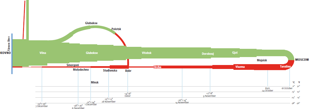
From John Schneider's Napoleonic Literature page; this is the largest and most detailed re-creation of Minard's graphic I have found on the Web. All the place names and troop strengths are highly legible. The Napoleonic Literature site contains many electronic books and a wealth of information. |
 |
Integrating temperature information
Full size graphic (541x308) [9K]
SAGE design page
This graph, from the Visualization and Intelligent Interfaces group at CMU is one re-design, attempting to link the information about temperature directly to the path and strength of Napoleon's army, emphasizing their interrelations more directly. The (X,Y) coordinates are still map-based (latitude and longitude). "The use of color clearly shows the heat wave during the advance and the steady decline in temperature through the retreat. The exception, a spell of temperatures above freezing, is clearly visible when the retreating army is between the cities of Krasnyj and Bobr." |
| Animated graphic
Full size graphic (536x182) [158K]
from Max Boylan's march page
Here is a similar graphic, but done as an animated GIF image, from Max Boylan at SFSU. We start with an empty map on June 24, 1812, as the campaign begins at the Nemen River with 422,000 troops. The animation shows the step-by-step progress of the Grand Army to Moscow and back. The coding of temperature by color is done somewhat better than in the SAGE graphic above. The animation repeats 10 times. |
|
 |
Making time explicit
Full size graphic (541x308) [9K]
SAGE design page
"The temporal characteristics of the march were weakly conveyed in the original because they were expressed as text labels. Here the relation between date, troop location (longitude only), and temperature is more strongly conveyed because they are all exp ressed as properties of the rectangles. Battle sites are indicated in text." |
 |
Animated graphic
Full size graphic (547 x 346) [388K]
This version, by Aaron Walburg and Stephen Hartzog, listed on the University of York History of Statistics page uses a real map of the region from Poland to Moscow as the background. It overlays on this an animated sequence showing the size of Napoleon's army (with dates), and the retreat, together with the decline of temperature. In many ways, this is my favorite modern rendition. |
 |
3D Cube graphic
Full size graphic (300 x 225; 20K)
This version, by Menno-Jan Kraak, of the International Institute for Aerospace Survey and Earth Sciences (ITC) is one of several 3D renditions on a lovely web site, Geovisualization and Minard's Map. This one unravels time into the 3rd dimension, superposed above the base map. The web site contains the largest collection of variations of Minard's map, with several interactive and animated versions, and a comprehensive list of references and other links. |
 |
The human side
Full size graphic (465 x 225; 56K)
In an article published in Technical Communication, August 2001, Dragga and Voss ``The Inhumanity of Technical Illustrations'' suggest that Minard's graphic does not convey the human cost directly--- ``We don't see the people and we don't see their anguish.'' They present this image using pictographs, which gradually change from soldiers to burial crosses, to illustrate how ``ethically conscious technical communicators could introduce the human element...'' Well, it is not clear to me that the addition of hokey clip art soldiers and crosses does much to enhance Minard's image, but chacun a` son gou^t! |
 |
A drill-down SAS GMAP with tooltips
Full size graphic (465 x 225; 56K)
Robert Allison created this two-level, zoomable version with interactive tooltips, as a lovely "proof-of-concept" example. He used SAS/GRAPH map data sets for the map information, and PROC GMAP to draw the map, using the SAS/GRAPH annotate facility to overlay Minard's data on the map. The interactive zooming and tooltips make use of the SAS ODS facility. See Robert's How I did this for further information. Here is the SAS code used to generate the maps. |
 |
Protovis: JavasSript toolkit + Google map
Full size JPG graphic (804 x 459; 85K);
Full size PNG graphic (905 x 504; 432K);
Protovis Minard example, with source code and data.
Protovis is a graphical toolkit for visualization by Michael Bostock and Jeffrey Heer from the Stanford vis group. It aims to be a general system for constructing visualizations, and is implemented in JavaScript. This version uses the Google Maps API to overlay Minard's graphic on a Google map of the region. The demo web page shows the JS code and data used to create this version. Thanks to Antonio Saade for bringing this to my attention
|
|
A graphic designer's view
Full size graphic
(1084 x 384; 31K)
Joel Katz, a graphic designer, at Joel Katz Design Associates
looks at Minard's graphic from the point of view of
In my own map, I was looking to highlight one of those four issues--loss of life and its RATE--and to reduce the role of geography.Yet, while sacrificing exact geography, this design highlights the relations among the essential elements. [Credit: From the lovely book,
Designing Information: Human factors,
perception, and common sense in Information Design, by Joel Katz. Hoboken, John Wiley & Sons, 2012.
Thanks to Joel Katz for permission to use this image here.
See his YouTube video, describing his vision for the book.
Then, go BUY THIS BOOK. You won't be disappointed!]
|
|
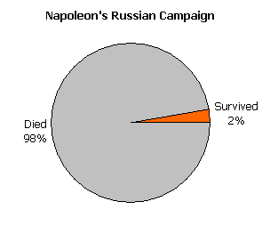
Dumb it Down for the Executive Summary? Full size (313 x 254; 3.8K)
Sadly, there are always people who want to dumb things down for an executive summary.
Seth Godin's Principle: This is one of the worse graphs ever made. He [Tufte]'s very happy because it shows five different pieces of information on three axis and if you study it for fifteen minutes it really is worth a thousand words. I don't think that's what graphs are for. I think they try to make a point in two seconds for people who are too lazy to read the forty words underneath. The pie chart by Godin might be just *one* executive summary, but any executives who relied on it would be ill-served, if they had to use it for decision making. Hey -- Napoleon, you shouldn't have done that! Duh? Why not? what went wrong? what could you have done differently? |
|
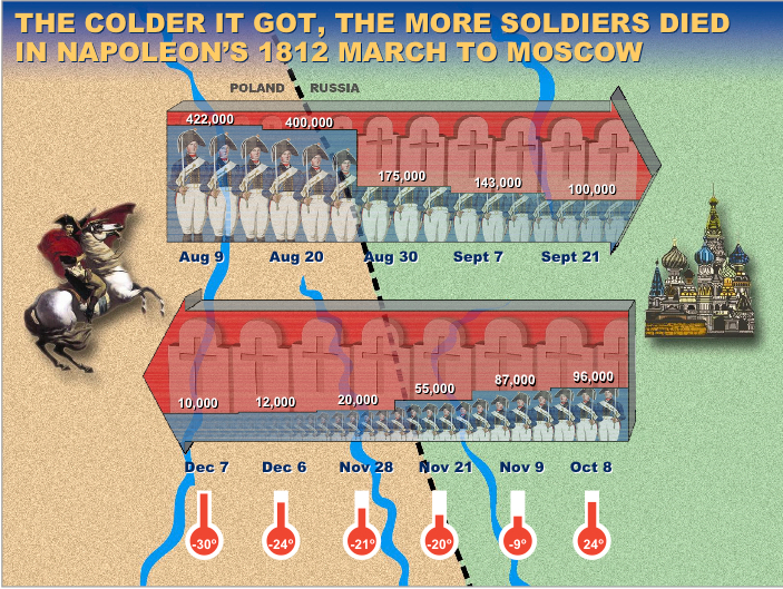
Say it with PowerPoint?
Full size (703 x 529; 827K);
from
Gene Zelazny responds to Tufte on the famous Minard graphic
Gene Zelazny, a self-nominated presentation guru and author of Say It With Charts and Say It With Presentations tries to show the power of PowerPoint in this rendering. He designed this slide relying "on the sophistocation of PowerPoint as a production tool" (whatever that means). It was intended to be shown as an animated build, first revealing the path from left to right of the advance on the top, then revealing the path from right to left of the retreat on the bottom. A nice demonstration of what you can do with PowerPoint? Perhaps. But it fails to make the complexity of Minard's story apparent by reducing it to an info graphic. Even the title is wrong -- temperature was an important factor on the retreat, but the losses due to battles and desertion on the advance were also important. Still, I sort of like the idea of showing the number of troops alive vs. those who died by the divided pictogram bars. On the other hand if you look carefully at the thermometer bars at the bottom, you'll see they bear no visual relationship to the temperatures shown by numbers. |
|
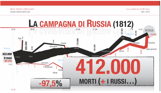
Minard: The Movie
Full size (545 x 313; 113K)
from Marco Meschini's La campagna di Russia di Napoleone nel 1812 , a 6 minute movie and lecture (in Italian) Meschini built a video lesson based on Minard's graph, with some historical insight about the fate of Napoleon's russian campaign. The movie builds the graphic over time and reinforces some key-points with images and info in a mixed text and iconic mode.
|
Michael Friendly
