DataVis.ca
Michael Friendly
York University

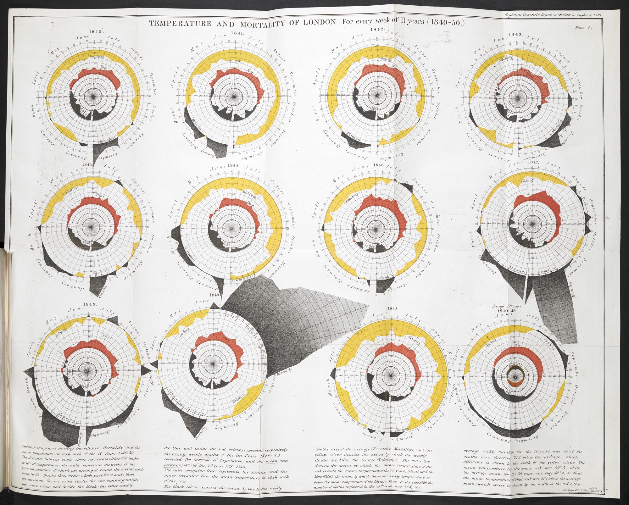
Title: Temperature and Mortality of London
Author: William Farr
Location: London, England
Year: 1852
Before the water-borne source of cholera was discovered by John Snow in 1854, William Farr constructed these circular diagrams showing relative mortality and mean temperature in London from 1840-1850. Could mortality be related to temperature?
Along the outer circle, the black areas show the weeks in which mortality exceeds the average weekly rate over all years, and yellow shows the weeks it is less.
Similarly, the inner circles show temperature, using red for hotter than average and yellow for less than average.
Something really bad happened in the summer of 1849, but also in the winter of 1847. What other causes might there be? This graph was a pre-cursor of Florence Nightingale’s famous “rose diagram” and inspired her use.
©2007.
 Except where otherwise noted, the Gallery of Data Visualization by
Michael Friendly is licensed under a
Except where otherwise noted, the Gallery of Data Visualization by
Michael Friendly is licensed under a
Creative Commons Attribution-NonCommercial 3.0 License. Please cite any uses of this work as shown below.
Citation: Friendly, Michael (2001), Gallery of Data Visualization, Electronic document, http://www.datavis.ca/gallery/,
Except where otherwise noted, the Gallery of Data Visualization by
Michael Friendly is licensed under a Creative Commons Attribution-NonCommercial 3.0 License. Please cite any uses of this work as shown below.
Citation: Friendly, Michael (2001), Gallery of Data Visualization, Electronic document, http://www.datavis.ca/gallery/,