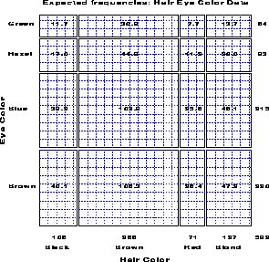
Figure 7: Expected frequencies under independence.
Table 1: Hair-color eye-color data
                      Hair Color
Eye
Color     BLACK    BROWN      RED    BLOND  | Total
                                            |
Brown        68      119       26        7  |   220
Blue         20       84       17       94  |   215
Hazel        15       54       14       10  |    93
Green         5       29       14       16  |    64
--------------------------------------------+------
Total       108      286       71      127  |   592
For any two-way table, the expected frequencies under independence can be represented by rectangles whose widths are proportional to the total frequency in each column, f sub +j , and whose heights are proportional to the total frequency in each row, f sub i+ ; the area of each rectangle is then proportional to e sub ij . Figure 7 shows the expected frequencies for the hair and eye color data.
Figure 7: Expected frequencies under
independence.
Riedwyl and Schüpbach (1983, 1994) proposed a sieve diagram (later called a parquet diagram ) based on this principle. In this display the area of each rectangle is proportional to expected frequency and observed frequency is shown by the number of squares in each rectangle. Hence, the difference between observed and expected frequency appears as the density of shading, using color to indicate whether the deviation from independence is positive or negative. (In monochrome versions, positive deviations are shown by solid lines, negative by broken lines.) The sieve diagram for hair color and eye color is shown in Figure 8.
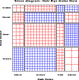
Figure 8: Sieve diagram for hair-eye data.
Figure 9 shows data on vision acuity in a large sample of women (n=7477). The diagonal cells show the obvious: people tend to have the same visual acuity in both eyes, and there is strong lack of indepence. The off diagonal cells show a more subtle pattern which suggests symmetry, and a diagonals model.
Figure 10 shows the frequencies with which draft-age men with birthdays in various months were assigned priority values for induction into the US Army in the 1972 draft lottery. The assignment was supposed to be random, but the figure shows a greater tendency for those born in the latter months of the year to be assigned smaller priority values.
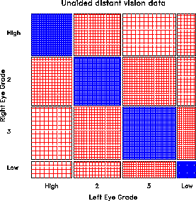
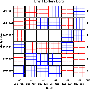
Figure 9: Vision classification data for
7477 women
Figure 10: Data from the US Draft Lottery
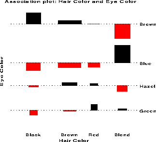
For a two-way contingency table, the signed contribution to Pearson chi² for cell i, %j is
d sub ij = < f sub ij - e sub ij > over < sqrt < e sub ij > > = roman ' std. residual' fwd 300 chi² = Sigma Sigma sub ij %% ( d sub ij ) sup 2In the association plot , each cell is shown by a rectangle:
      sqrt e sub ij
  +---------------------+
  |                     |
  | area = f_ij - e_ij  |
  |                     | d sub ij |=  {f sub ij  -  e sub ij} over {sqrt e sub ij}
  |                     |
  +---------------------+
The rectangles for each row in the table are positioned relative to a
baseline representing independence ( d sub ij = 0 ) shown by
a dotted line. Cells with observed > expected frequency rise
above the line (and are colored black); cells that contain less than
the expected frequency fall below it (and are shaded red).
(4)
Sex is fun for me and my partner (a) Never or occasionally, (b) fairly often, (c) very often, (d) almost always.
              |-------- Wife's Rating -------|
Husband's     Never   Fairly     Very   Almost
Rating          fun    often    Often   always       SUM

Never fun         7        7        2        3        19
Fairly often      2        8        3        7        20
Very often        1        5        4        9        19
Almost always     2        8        9       14        33

SUM              12       28       18       33        91
Unweighted kappa gives the following results
 Observed and Expected Agreement (under independence)

Observed agreement           0.3626
Expected agreement           0.2680

Cohen's Kappa (Std. Error)   0.1293  (0.1343)
Two commonly-used pattern of weights are those based on integer spacing of the category scale and Fleiss-Cohen weights .
       Integer Weights                 Fleiss-Cohen Weights
   1     2/3     1/3       0          1     8/9     5/9      0
 2/3       1     2/3     1/3        8/9       1     8/9    5/9
 1/3     2/3       1     2/3        5/9     8/9       1    8/9
   0     1/3     2/3       1          0     5/9     8/9      1
These weights give a somewhat higher assessment of agreement (perhaps
too high).
                    Obs    Exp              Std     Lower     Upper
                    Agree  Agree   Kappa    Error    95%       95%

 Unweighted         0.363  0.268   0.1293   0.134   -0.1339   0.3926
 Integer Weights    0.635  0.560   0.1701   0.065    0.0423   0.2978
 Fleiss-Cohen Wts   0.814  0.722   0.3320   0.125    0.0861   0.5780
title 'Kappa for Agreement';
data fun;
   label husband = 'Husband rating'
         wife    = 'Wife Rating';
   do husband = 1 to 4;
   do wife    = 1 to 4;
      input count @@;
      output;
      end; end;
cards;
 7     7     2      3
 2     8     3      7
 1     5     4      9
 2     8     9     14
;
proc freq;
   weight count;
   tables husband * wife / noprint agree;
run;
This produces the following output:
+-------------------------------------------------------------------+
|                                                                   |
|                       Kappa for Agreement                         |
|             STATISTICS FOR TABLE OF HUSBAND BY WIFE               |
|                                                                   |
|                         Test of Symmetry                          |
|                         ----------------                          |
|      Statistic = 3.878        DF = 6        Prob = 0.693          |
|                                                                   |
|                        Kappa Coefficients                         |
|      Statistic        Value     ASE   95% Confidence Bounds       |
|      ------------------------------------------------------       |
|      Simple Kappa     0.129   0.069      -0.005    0.264          |
|      Weighted Kappa   0.237   0.078       0.084    0.391          |
|                                                                   |
|      Sample Size = 91                                             |
|                                                                   |
+-------------------------------------------------------------------+
The agreement chart is constructed as an n x n square, where n is the total sample size. Black squares, each of size n sub ii x n sub ii , show observed agreement. These are positioned within larger rectangles, each of size n sub i+ x n sub +i . The large rectangle shows the maximum possible agreement, given the marginal totals. Thus, a visual impression of the strength of agreement is
(5)
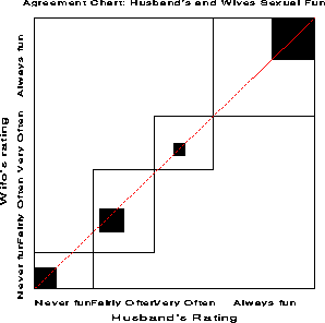
Figure 12: Agreement chart for husbands
and wives sexual fun. The B sub N measure is the ratio of
the areas of the dark squares to their enclosing rectangles, counting
only exact agreement. B sub N = 0.146 for these data.
left "" matrix < ccol < ' ' above ' ' above n sub < i,i-b > above ' ' above ' ' > ccol < ' ' above ' ' above ... above ' ' above ' ' > ccol < n sub < i-b,i > above : above n sub ii above : above n sub < i+b,i > > ccol < ' ' above ' ' above ... above ' ' above ' ' > ccol < ' ' above ' ' above n sub < i,i+b > above ' ' above ' ' > > right "" fwd 350 left "" matrix < ccol < ' ' above ' ' above w sub 2 above ' ' above ' ' > ccol < ' ' above ' ' above w sub 1 above ' ' above ' ' > ccol < w sub 2 above w sub 1 above 1 above w sub 1 above w sub 2 > ccol < ' ' above ' ' above w sub 1 above ' ' above ' ' > ccol < ' ' above ' ' above w sub 2 above ' ' above ' ' > > right ""This is incorporated in the agreement chart by successively lighter shaded rectangles whose size is proportional to the sum of the cell frequencies, denoted A sub bi , shown schematically above. A sub 1i allows 1-step disagreements, A sub 2i includes 2-step disagreements, etc. From this, one can define a weighted measure of agreement, analogous to weighted kappa .
B sub N sup w = < roman 'weighted sum of areas of agreement' > over < roman 'area of rectangles' > = size +3 1 - < Sigma from i to k % [ n sub i+ n sub +i - n sub ii sup 2 - Sigma from b=1 to q % w sub b A sub bi ] > over < Sigma from i to k % n sub i+ % n sub +i >where w sub b is the weight for A sub bi , the shaded area b steps away from the main diagonal, and q is the furthest level of partial disagreement to be considered.
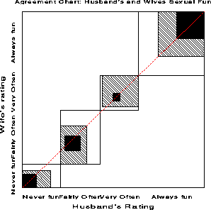
Figure 13: Weighted agreement chart.. The
B sub N sup w measure is the ratio of the areas of the dark
squares to their enclosing rectangles, weighting cells one step
removed from exact agreement with w sub 1 = 8 div 9 = .889
. B sub N sup w = 0.628 for these data.
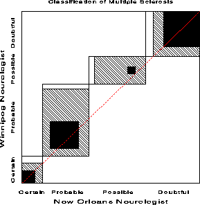
New Orleans    |------- Winnipeg Neurologist ------|
Neurologist    Certain  Probable  Possible  Doubtful       SUM

 Certain  MS         5         3         0         0         8
 Probable MS         3        11         4         0        18
 Possible MS         2        13         3         4        22
 Doubtful MS         1         2         4        14        21

 SUM                11        29        11        18        69
title "Classification of Multiple Sclerosis: Marginal Homogeneity";
proc format;
   value diagnos 1='Certain ' 2='Probable'  3='Possible'  4='Doubtful';

data ms;
 format win_diag no_diag diagnos.;
   do win_diag = 1 to 4;
   do no_diag  = 1 to 4;
      input count @@;
      if count=0 then count=1e-10;
      output;
      end; end;
cards;
   5     3     0      0
   3    11     4      0
   2    13     3      4
   1     2     4     14
;
In this analysis the diagnostic categories for the two neurologists
are repeated measures, since each patient is rated twice. To test
whether the marginal frequencies of ratings is the same we specify
response marginals (The oneway option displays
the marginal frequencies, not shown here.)
title "Classification of Multiple Sclerosis: Marginal Homogeneity";
proc catmod data=ms;
   weight count;
   response marginals;
   model win_diag * no_diag = _response_ / oneway;
   repeated neuro 2 / _response_= neuro;
The test of marginal homogeneity is the test of NEURO in this model:
+-------------------------------------------------------------------+
|                                                                   |
|                   ANALYSIS-OF-VARIANCE TABLE                      |
|                                                                   |
|       Source                   DF   Chi-Square      Prob          |
|       --------------------------------------------------          |
|       INTERCEPT                 3       222.62    0.0000          |
|       NEURO                     3        10.54    0.0145          |
|                                                                   |
|       RESIDUAL                  0          .       .              |
|                                                                   |
+-------------------------------------------------------------------+
Because the diagnostic categories are ordered, we can actually obtain a more powerful test by assigning scores to the diagnostic category and testing if the mean scores are the same for both neurologists. To do this, we specify response means.
title2 'Testing means';
proc catmod data=ms order=data;
   weight count;
   response means;
   model win_diag * no_diag = _response_;
   repeated neuro 2 / _response_= neuro;
+-------------------------------------------------------------------+
|                                                                   |
|                   ANALYSIS-OF-VARIANCE TABLE                      |
|                                                                   |
|       Source                   DF   Chi-Square      Prob          |
|       --------------------------------------------------          |
|       INTERCEPT                 1       570.61    0.0000          |
|       NEURO                     1         7.97    0.0048          |
|                                                                   |
|       RESIDUAL                  0          .       .              |
|                                                                   |
+-------------------------------------------------------------------+
Figure 15 shows aggregate data on applicants to graduate school at Berkeley for the six largest departments in 1973 classified by admission and gender. At issue is whether the data show evidence of sex bias in admission practices (Bickel et al., 1975). The figure shows the cell frequencies numerically, but margins for both sex and admission are equated in the display. For these data the sample odds ratio, Odds (Admit|Male) / (Admit|Female) is 1.84 indicating that males are almost twice as likely in this sample to be admitted. The four-fold display shows this imbalance clearly.
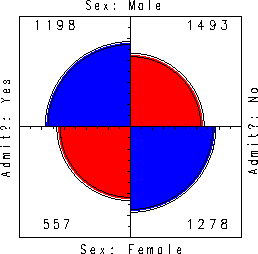 Figure 15: Four-fold display for Berkeley
admissions. The area of each shaded quadrant shows the frequency,
standardized to equate the margins for sex and admission. Circular
arcs show the limits of a 99% confidence interval for the odds ratio.
Figure 15: Four-fold display for Berkeley
admissions. The area of each shaded quadrant shows the frequency,
standardized to equate the margins for sex and admission. Circular
arcs show the limits of a 99% confidence interval for the odds ratio.
The 99% confidence intervals in Figure 15 do not overlap, indicating a significant association between sex and admission. The width of the confidence rings give a visual indication of the precision of the data.
The admissions data shown in Figure 15 were obtained from six departments, so to determine the source of the apparent sex bias in favor of males, we make a new plot, Figure 16, stratified by department.
Surprisingly, Figure 16 shows that, for five of the six departments, the odds of admission is approximately the same for both men and women applicants. Department A appears to differs from the others, with women approximately 2.86 ( = ' ' ( 313/19 ) / (512/89) ) times as likely to gain admission. This appearance is confirmed by the confidence rings, which in Figure 16 are joint 99% intervals for theta sub c , ' ' % c = 1, ... , k .
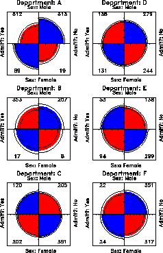 Figure 16: Fourfold display of Berkeley
admissions, by department. In each panel the confidence rings for
adjacent quadrants overlap if the odds ratio for admission and sex
does not differ significantly from 1. The data in each panel have
been standardized as in Figure 15.
Figure 16: Fourfold display of Berkeley
admissions, by department. In each panel the confidence rings for
adjacent quadrants overlap if the odds ratio for admission and sex
does not differ significantly from 1. The data in each panel have
been standardized as in Figure 15.
(This result, which contradicts the display for the aggregate data in Figure 15, is a classic example of Simpson's paradox. The resolution of this contradiction can be found in the large differences in admission rates among departments as we shall see later.)