DataVis.ca
Michael Friendly
York University

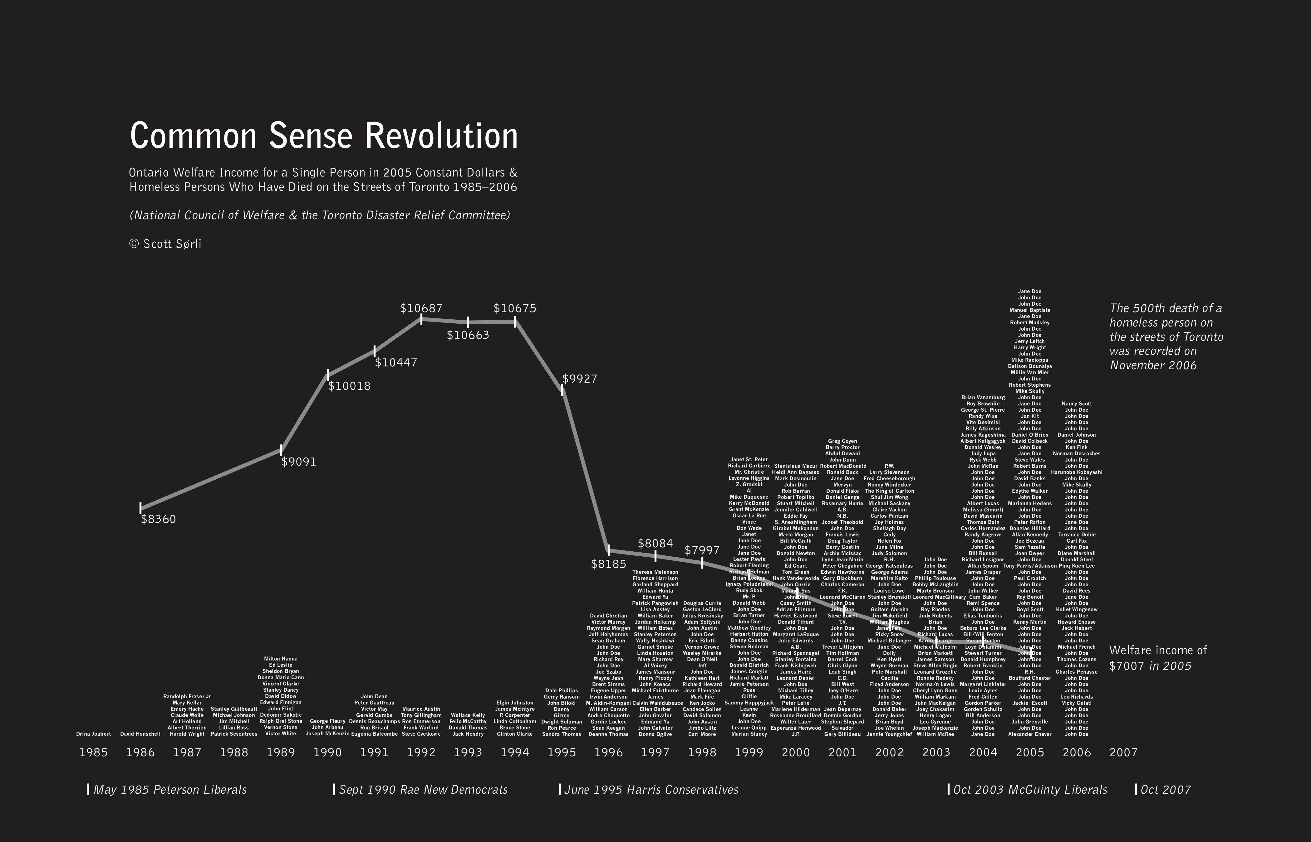
Title: Common Sense Revolution
Author: Scott Sorli
Location: Ottawa, Canada
Year: 2007
A starking contrast of black and white. A simple message received loud and clear. The names of real people who died on the streets of Toronto and the welfare rate for ontarions in contrast. By overlaying these two variables, the author makes it very hard to de-link the two and their relationship.
Do you see the message?
So much for common sense, right?
Source: http://homelesshub.ca/gallery/common-sense-revolution
©2007.
 Except where otherwise noted, the Gallery of Data Visualization by
Michael Friendly is licensed under a
Except where otherwise noted, the Gallery of Data Visualization by
Michael Friendly is licensed under a
Creative Commons Attribution-NonCommercial 3.0 License. Please cite any uses of this work as shown below.
Citation: Friendly, Michael (2001), Gallery of Data Visualization, Electronic document, http://www.datavis.ca/gallery/,
Except where otherwise noted, the Gallery of Data Visualization by
Michael Friendly is licensed under a Creative Commons Attribution-NonCommercial 3.0 License. Please cite any uses of this work as shown below.
Citation: Friendly, Michael (2001), Gallery of Data Visualization, Electronic document, http://www.datavis.ca/gallery/,