DataVis.ca
Michael Friendly
York University

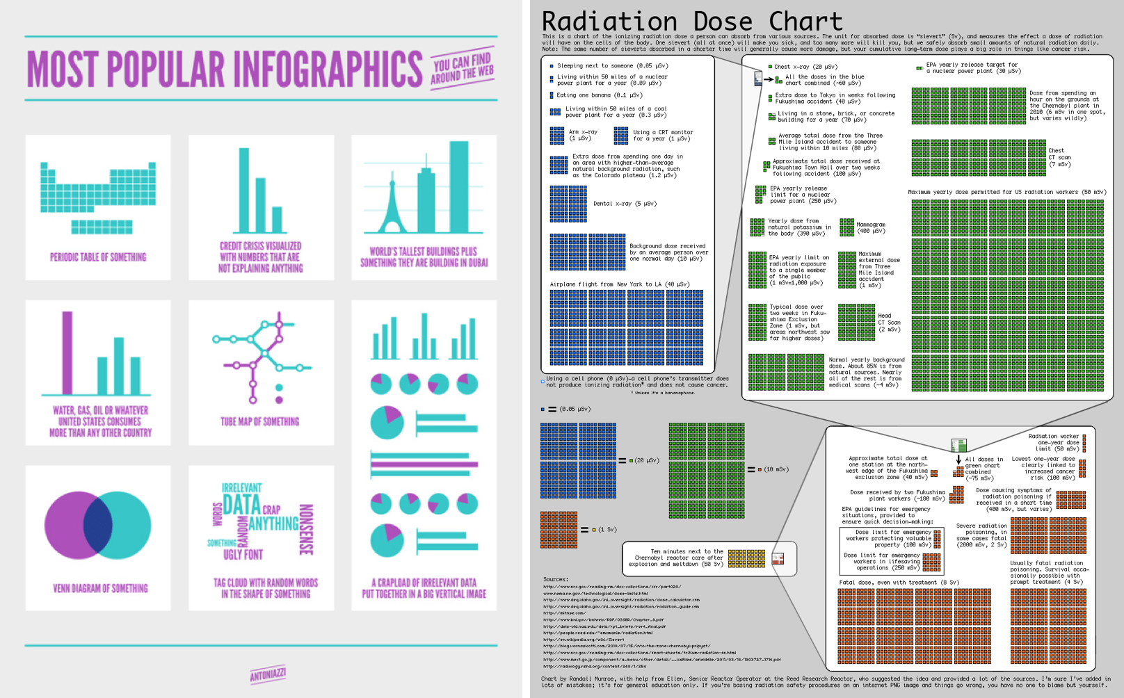
Title: Radiation Dose Chart
Author: Randall Monroe
Location: Somerville, MA, U.S.A.
Year: 2011
These two displays contrast empty (informationless) infographics with high-content ones (perhaps too high for a static display).
The one at the left is a parody of a newspaper textbox labeled "By the Numbers," similar to this image, where the goal is only to attract the reader's attention. That's OK. Just don't try to present it as a pie chart, or pretend that it is an Infographic.
The one at the right, Randall Munroe's xkcd webcomic site attempts to show something serious in an infographic - the levels of an ionizing radiation dose a person can absorb from various sources, and put them in perspective over many scales, with descriptions of what a given value means.
The unit in the chart is the "sievert" (Sv), the effect a dose of radiation will have on a human body. The chart spans many orders of magnitude, from Sleeping next to someone (0.05 μSv), to a chest x-ray (20 μSv), to a fatal dose, even wih treatment (8 Sv), and finally to the dose from 10 minutes next to the Chernobyl reactor after meltdown (50 Sv).
Source for second image: http://xkcd.com/radiation
 Except where otherwise noted, the Gallery of Data Visualization by
Michael Friendly is licensed under a
Except where otherwise noted, the Gallery of Data Visualization by
Michael Friendly is licensed under a Creative Commons Attribution-NonCommercial 3.0 License. Please cite any uses of this work as shown below.
Citation: Friendly, Michael (2001), Gallery of Data Visualization, Electronic document, http://www.datavis.ca/gallery/,