DataVis.ca
Michael Friendly
York University

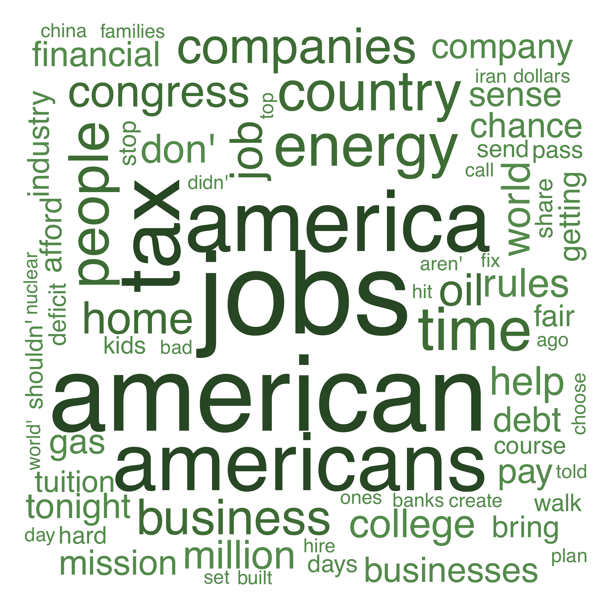
Title: A Word Cloud of Obama’s State of the Union Address
Author: Michael Friendly
Location: Toronto, Canada
Year: 2012
This word cloud is a graphic representation of the most frequent words appearing in Obama’s 2012 State of the Union Address, with the size of each word proportional to it’s frequency in the text.
It was produced using the tm (text mining) and wordcloud packages in R. Overall, it gives a good indication of what Obama was thinking: Jobs (not Steve).
From an information visualization perspective, the range of word sizes provides a sort of 'zoom' function to focus on a smaller/wider range of word frequencies.
Computationally, the problem of placing and sizing words in a word cloud, allowing different orientations, is a non-trivial task. As well, transforming arbitrary text to data suitable for a word cloud still presents some challenges.
©2007.
 Except where otherwise noted, the Gallery of Data Visualization by
Michael Friendly is licensed under a
Except where otherwise noted, the Gallery of Data Visualization by
Michael Friendly is licensed under a
Creative Commons Attribution-NonCommercial 3.0 License. Please cite any uses of this work as shown below.
Citation: Friendly, Michael (2001), Gallery of Data Visualization, Electronic document, http://www.datavis.ca/gallery/,
Except where otherwise noted, the Gallery of Data Visualization by
Michael Friendly is licensed under a Creative Commons Attribution-NonCommercial 3.0 License. Please cite any uses of this work as shown below.
Citation: Friendly, Michael (2001), Gallery of Data Visualization, Electronic document, http://www.datavis.ca/gallery/,